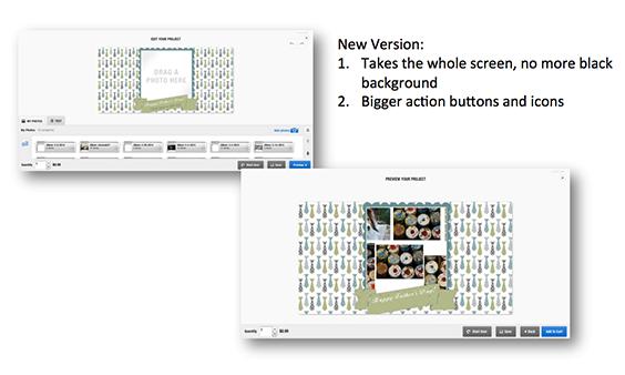
The new LifePics configurator has been live for several days and response has been extremely positive, with advances being made in the user experience and functionality. The new interface is more intuitive, with larger buttons and easy to understand steps and language. The updated look and feel not only make the interface appear more modern, but also increase usability for consumers.
Take a closer look.

Improved Features:
1. Step indicator on top of every page – distinctive and clear. Along the top of every page users will see how far along they are in the configuration process, making it easy to understand how many steps are required to complete their project.

2. Viewer buttons on the bottom of the page that are only visible when the action is available. Unnecessary buttons have been removed, leaving only available options, to reduce any consumer confusion.

3. Tabs on the bottom of the page – larger and more in-sync with the user flow. New language, iconography and fonts are more intuitive and simplified for the consumer.

Should you have any questions about the new version of the configurator simply contact your Photo Direct representative.