Spend any amount of time in the paint samples at the hardware store and you know that “red” can mean hundreds, if not thousands of different colours. In photography, colour can make or break a photo, but you don’t have to leave colours exactly how the camera saw them — and creating custom colour in Lightroom is almost as easy as choosing that favorite paint sample. Using Lightroom’s HSL, or hue, saturation, luminance panel, you can create custom colour effects without complex masking — and even create more contrast in your black and whites. Here’s how.
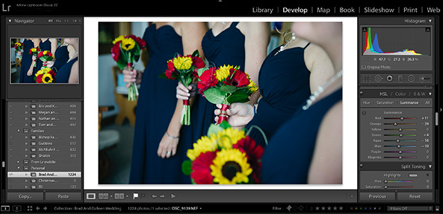
Colours can be adjusted in three different ways in the HSL panel — and unlike adjusting the saturation or vibrance slider, in the HSL panel, you can control colours individually.
Hue will change exactly what shade those colours appear. For example, sliding the red slider to the left will make the reds in the image a bit more of a hot pink, while moving to the right would turn those same reds into something closer to orange.
Saturation refers to just how much colour is there — it’s the difference between a very muted colour and a very vibrant one. If you take that same red slider but inside the saturation option and turn it all the way to the left, your reds will become grays. All the way to the right and you have a very deep vibrant red.
Luminance, on the other hand, refers to how light or dark the colour is. When you adjust the luminance, you can play with the exposure levels over a single colour at a time. Luminance doesn’t change the colour, but adds more shadow or more highlights. For example, adjusting the orange slider to the right is a popular way to brighten up skin tones.
By playing with the HSL panel in Lightroom, you can create a custom colour look to your shot. Adjusting the HSL is a popular way to make a digital file appear more like a specific type of film. For example, some film types change the hue of greens and blues. The HSL panel can also be helpful for adjusting minor colour casts or removing redness from the skin in a portrait (just watch and make sure you don’t remove all the red from the lips too).
But the HSL is more than just a tool for creating custom colour — it’s essential for creating better black and whites. In a black and white photo, the HSL panel switches to just one slider for each colour. What each slider does is adjust which shade of gray that colour becomes. By controlling how each colour converts, you can create more contrast in your black and white shots, or, if you prefer, create less contrast for a matte effect.
Controlling the HSL in a black and white shot can also take a boring black and white and make it interesting again. For example, reds and greens tend to convert to a similar shade of gray, which means if you have a photo of a red flower, the petals and the leaves are going to blend in. Using the colour sliders, you can lighten up the red and darken up the green, creating contrast in a shot that would otherwise be bland in black and white.
Once you understand what each slider in the HSL panel does, you can create images with colourful punch, or mimic the look of a matte film. Try opening an image and playing with the sliders, watching the image as the slider adjusts to see how that slider works. Then, have fun colour mixing to find the look that works for you. You can also find inspiration from a favorite film shot or another shot you admire and use the HSL sliders to recreate that digitally.
Colour can make or break a shot, and in particular when shooting RAW, creating a custom colour palette can help give your image that final punch.
